Wednesday, July 10, 2019

Using long term unemployment claims as confirmation for initial claims


 - by New Deal democrat

In the last few months, I’ve been paying extra attention to the weekly reports of initial jobless claims. Today I want to compare them to long-term claims (15 weeks or over) for unemployment benefits.

Way back about a decade ago, one of the occasional co-bloggers here was Invictus, who personally knew and subsequently was scooped up by Barry Ritholtz. Well, he still writes, and his Twitter feed is worth checking out. 

So anyway, last week he tweeted this:


It had been a long time since I checked this series, so I wanted to double-check the claim that it always turned up before a recession. The answer is, usually that has been true, but it made its expansion low in the exact month that a recession started three times (1948, 1953, and 1981), and made its low one month after a recession had already started once (1960).

Also, my recollection was that short term unemployment turned up first (0 to 5 weeks), then intermediate term (5 to 14 weeks), before longer term 15+ weeks turned up. That is still correct, but the drawback is that short term claims are much noisier and unreliable compared with long term claims:


Here is the YoY% change perspective (divided into two time periods), which better shows that short term unemployment leads long term unemployment — but is too noisy to be of much use:


But of course, we don’t have to rely on the monthly unemployment numbers when we have weekly initial claims. As the graph below shows, these *also* lead long term claims, but are much less noisy than the monthly short term unemployment number (note I have averaged initial claims monthly to cut down further on noise in the below two graphs):


The leading/lagging relationship is easy to see when we graph the YoY% change in the two series:


One of the two ways I measure signal in initial claims is if they turn higher YoY on a monthly basis, but there are some false positives. It turns out, when we add long term claims as a confirmatory signal, we only get two false positives, in 1985 and 1996, for only one month each. That’s five accurate signals to two false ones. If we insist on two months in a row, there are no false positives — although as set forth above, there are two false negatives since 1960 in the sense that you don’t get the signal until the month the recession starts or one month later.

Still, using long term unemployment claims as a confirmatory signal looks very useful in terms of adding to the reliability of the forecast.  And speaking of initial claims, their monthly average between July and September was between 212,000 and 215,250 - so the likelihood that they will send a negative signal in the next several months looks high.

Tuesday, July 9, 2019

May JOLTS report is weak, consistent with last month’s weak jobs report


 - by New Deal democrat

The jobs report one month ago was poor, so as expected the JOLTS report for May, released this morning, followed suit.

To review, because this series is only 20 years old, we only have one full business cycle to compare. During the 2000s expansion:

  • Hires peaked first, from December 2004 through September 2005
  • Quits peaked next, in September 2005
  • Layoffs and Discharges peaked next, from October 2005 through September 2006
  • Openings peaked last, in April 2007 
as shown in the below graph (normed to 100 as of May 2018):


As shown above, in today’s report, all of the above series, as well as job openings, declined month over month. Additionally, the only series that were higher compared with one year ago were job openings (+2.8% but significantly off its November 2018 high) and quits (+2.5%)


Next, here is the history of the “hiring leads firing” (actually, total separations) metric, measured quarterly to cut down on noise):


And here is the monthly measure for the last five years (plus job openings in blue):


As you can see, both hires and fires have essentially gone sideways for the last twelve months. It is possible both are at a turning point, but it is impossible to know.

Only layoffs and discharges have shown an improving trend over the last year, and ticked lower in May, although they are off their best readings:


To sum up, job openings have declined about -4% from their peak six months ago. Hires, quits, and total separations have been rangebound, with the only improvement in layoffs and discharges. 

While the absolute levels are solid, this month’s report, just like last month’s jobs report, does not show an improving jobs market. But since the June jobs report was strong, we can expect the JOLTS report next month to be stronger as well.

Monday, July 8, 2019

Scenes from the June employment report


 - by New Deal democrat

As I (and everyone else) wrote on Friday, the establishment portion of the June jobs report was very good.

On closer examination, though, the leading components of the report continued to show some weakness.

To begin with, for months I’ve been following manufacturing, residential construction, and temporary employment as the leading sectors. As the below graph of the past 18 months shows, all were positive in June:

But if you compare each bar (blue, red, green), you see that two of the three sectors nevertheless came in considerably lower for June with the average in that sector from 2018 (17k vs. 21K, 4.6k vs. 4.3k, 4.3k vs. 6k, respectively).

More broadly, jobs in goods producting industries turn down in advance of recessions much more sharply than those in service producing sectors:


There has been a significant turn-down in goods producing jobs in the past six months, although it is consistent with a slowdown only at this point.

Finally, I’ve been watching initial jobless claims as a leader for the unemployment rate. Here’s what that update looks like through June (note jobless claims are averaged monthly):


Initial jobless claims have trended essentially sideways, averaging between 212,000 and 225,000 over the past 17 months. Meanwhile the unemployment rate has trended slightly downward. If initial claims continue to trend sideways, I expect the unemployment rate to stagnate as well. Note also that initial claims will have very difficult YoY comparisons for the next four months. If they trend higher YoY, that is a cautionary signal consistent with a possible recession shortly thereafter.

Saturday, July 6, 2019

Weekly Indicators for July 1 - 5 at Seeking Alpha


 - by New Deal democrat

My Weekly Indicators post is up at Seeking Alpha. Lower long term interest rates continue to improve the long range forecast, while the short term forecast has deteriorated.

As usual, clicking over and reading puts a penny or two in my pocket to help reward me for my efforts.

Friday, July 5, 2019

June jobs report: excellent establishment survey, mediocre household survey


 - by New Deal democrat

HEADLINES
  • +224,000 jobs added
  • U3 unemployment rate rose 0.1% from 3.6% to 3.7%
  • U6 underemployment rate rose 0.1% from 7.1% to 7.2% 

Leading employment indicators of a slowdown or recession

I am highlighting these because many leading indicators overall strongly suggest that an employment slowdown is coming. The following more leading numbers in the report tell us about where the economy is likely to be a few months from now. These were all positive this month.
  • the average manufacturing workweek rose 0.1 from 40.6 hours to 40.7 hours. This is one of the 10 components of the LEI. 
  • Manufacturing jobs rose by 17,000. YoY manufacturing is up 167,000, a deceleration from last summer’s pace.
  • construction jobs rose by 21,000. YoY construction jobs are up 204,000, also a deceleration from last summer. Residential construction jobs, which are even more leading, rose by 4600, the first monthly decline in the past three.
  • temporary jobs rose by 4300.
  • the number of people unemployed for 5 weeks or less declined by -186,000 from 2,147,000 to 1,961,000. The post-recession low was two months ago.

Wages and participation rates

Here are the headlines on wages and the broader measures of underemployment:
  • Not in Labor Force, but Want a Job Now: rose by 227,000 from 5.045 million to 5.322 million
  • Part time for economic reasons: declined by -8,000 from 4.355 million to 4.347 million
  • Employment/population ratio ages 25-54: unchanged at 79.7%. This remains a declined from the peak at the beginning of this year.
  • Average Hourly Earnings for Production and Nonsupervisory Personnel: rose $.04 from  $23.39 to $23.43, up +3.3% YoY. This is still a slight decline from the recent YoY% change peak.  (Note: you may be reading different information about wages elsewhere. They are citing average wages for all private workers. I use wages for nonsupervisory personnel, to come closer to the situation for ordinary workers.)  

Holding Trump accountable on manufacturing and mining jobs

 Trump specifically campaigned on bringing back manufacturing and mining jobs.  Is he keeping this promise?  
  • Manufacturing jobs rose an average of +14,000/month in the past year vs. the last seven years of Obama's presidency in which an average of +10,300 manufacturing jobs were added each month.   
  • Coal mining jobs were unchanged, an average of -100/month in the past year vs. the last seven years of Obama's presidency in which an average of -300 jobs were lost each month
April was revised downward by -8,000. May was also revised downward by -3,000, for a net change of -11,000.

Other important coincident indicators help  us paint a more complete picture of the present:
  • Overtime was unchanged at 3.4  hours.
  • Professional and business employment (generally higher-paying jobs) rose by 51,000 and  is up +1,482,000 YoY. 
  • the index of aggregate hours worked for non-managerial workers rose by 0.2%
  •  the index of aggregate payrolls for non-managerial workers rose by 0.5%  
Other news included:            
  • the  alternate jobs number contained  in the more volatile household survey rose by 247,000  jobs.  This represents an increase of 1,413,000 jobs YoY vs. 2,301,000 in the establishment survey. This survey, which has been negative three months this year, was a major disconnect from the establishment number. The household survey has a tendency to turn first, and this month it showed up in the establishment survey.
  • Government jobs rose by 33,000.
  • the overall employment to population ratio for all ages 16 and up was unchanged at 60.6% m/m and is up 0.2% YoY.          
  • The labor force participation rate rose 0.1% from  62.8% to 62.9% m/m and is unchanged YoY.

SUMMARY

Once again there is a divergence between the establishment report, which was excellent, and the household report, which was mediocre.

The best news was that all of the leading measures in the report were positive, taking back last month’s declines. Good professional and business jobs and government jobs rose strongly. Aggregate hours and payrolls also rose nicely. The only negative in the establishment survey was that revisions continued to be negative, which is thought to be something that happens at negative turning points.

While the monthly increase in jobs in the household report was also strongly positive, the YoY change continues to be lackluster, averaging about 125,000 jobs a month. Again, this is thought to be the kind of divergence that happens at negative turning points. Both the unemployment and underemployment rates rose. The participation’s rates and employment to population ratios were either flat monthly or flat YoY.

So, bottom line, this was mainly a very good report. Whether it signals that recent weakness was overblown, or whether it itself was a countertrend number, we will find out in the next month or two.

Wednesday, July 3, 2019

Initial claims on the cusp of turning neutral; expect a middling June jobs report


 - by New Deal democrat
I have started to monitor initial jobless claims to see if there are any signs of stress.

My two thresholds are:


1. If the four week average on claims is more than 10% above its expansion low.
2. If the YoY% change in the monthly average turns higher.

Here’s this week’s update, plus implications for the impending June jobs report.

As of this week, the four week average is now 10.3% above its recent low:


Last June the monthly average was 222,000. This year it was 221,500:

That is merely -0.2% better than last year. In other words, had this week’s number been just 1,000 higher,that would have been enough to tip this indicator from positive to neutral.
 Now let’s turn to implications for Friday’s jobs report. Since initial jobless claims lead the unemployment rate, here is the long term view of both as YoY% changes going back 50 years:  
  
Now here is the close-up on the past 8 years:
  

As you can see, there is no monthly correspondence, but there is a clear leading relationship. In both May and June, initial claims were barely below where they had been in May and June 2018.  The corresponding unemployment rates were 3.8% and 4.0%, respectively. As a result, I am anticipating that the unemployment rate will rise to the 3.7% to 3.9% range.
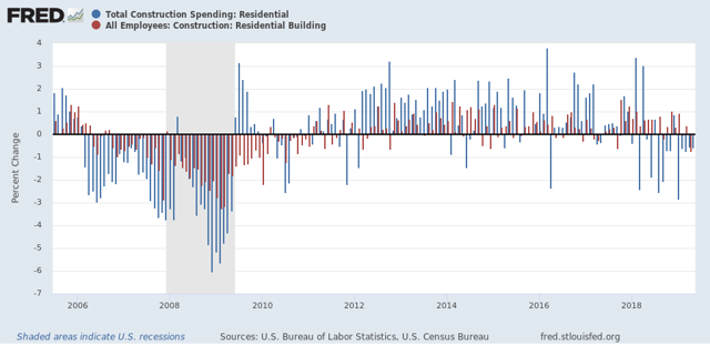
Another leading employment sector is residential construction employment. As the below graph shows, it follows residential construction spending on a YoY% basis:  
  
Residential construction employment declined last month, and it is most likely that it will show another decline this month.
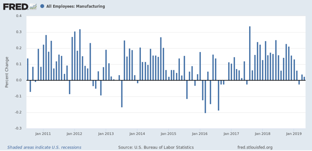
Additionally, the leading sector of manufacturing employment tends to follow the ISM manufacturing index with a lag of 3 to 9 months. Although FRED no long er carries the ISM data, it fell below 50 in both 2011 and 2015. As the below graph shows, manufacturing employment subsequently underwent monthly declines as well:  
Thus I am expecting another lackluster month for this sector.

Finally, here is the YoY graph from the American Staffing Association of temporary employment:
This has stopped deteriorating on a YoY basis, and has made a little bit of improvement. Thus I expect a weakly positive number for this sector.
Keep in mind that there is, as I said above, no simple month-to-month correspondence in these numbers, although on a longer term time frame it is clear.
But put together initial claims, residential construction, ISM manufacturing, and temporary staffing, and this suggests to me a middling type of number, probably between 120,000 and 160,000. 
We’ll see Friday.

Tuesday, July 2, 2019

In which I nitpick Prof. Jared Bernstein about a consumer “economic tailwind”


 - by New Deal democrat

Last Friday, following the release of May’s personal income and spending report, Prof. Jared Bernstein, whom I follow religiously, wrote among other things about some economic headwinds and tailwinds, including the following: 

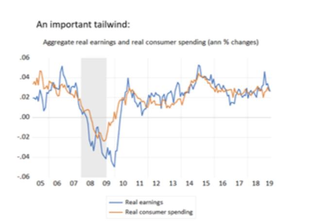
Finally, my personal favorite tailwind indicator [pointing to the below graph]: the close tracking between aggregate real earnings and consumer spending. The good news is they’re both clearly in expansion territory. The bad news is that they can both downshift within a few quarters:


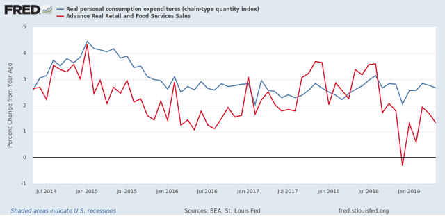
Although he labels them differently, the first is one of my favorites as well: real aggregate payrolls of production and non-supervisory employees. The second is real personal consumption expenditures. 

That piqued my interest, because over seven years ago I wrote that

real retail sales are much more volatile [than personal consumption expenditures]. And, . . .  in a very specific and non-random way
early in economic expansions, YoY real retail sales growth far outstrips YoY PCE growth. As the economy wanes into contraction, YoY real retail sales grow less and ultimately contract more than YoY PCE's. You can see that by noting that retail sales minus PCE's are always negative BEFORE the economy ever tips into recession [graph omitted]. That's 11 of 11 times. Further, in 10 of those 11 times (1957 being the noteworthy exception), the number was not just negative, but was continuing to decline for a significant period before we tipped into recession.

So normal is this pattern that it is one of my “mid-cycle indicators.” 

Okay, to the nitpick....

Prof. Bernstein’s post suggests that real personal consumption expenditures and real aggregate wages are coincident to one another. Since both are OK now, that’s a significant tailwind.

But what happens when we substitute real retail sales?

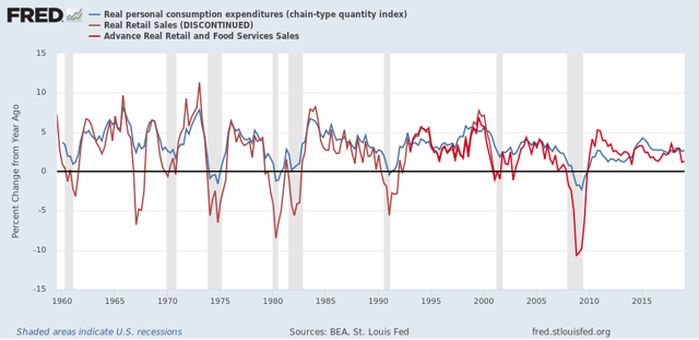
Let’s start with real personal consumption expenditures and real retail sales, going back 60 years (averaged quarterly to cut down on noise):


This graph confirms that (1) real retail sales more often than not slightly lead real personal consumption expenditures, and (2) real retail sales are much more volatile, especially to the downside, meaning they especially lead in the months leading up to a recession. Hence the “non-random way” in which the two measures differ.

Here’s the monthly comparison over the past five years:


After a resurgence following the 2017 hurricanes, YoY growth in real retail sales has fallen well below that of real personal consumption expenditures, including one negative month during the government shutdown “mini-recession.”

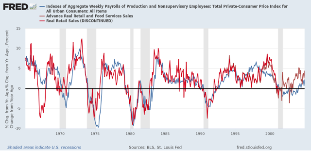
So, now let’s compare real aggregate payrolls to real retail sales. Here’s the long term look going back 55 years to the start of the series:


And here is the past 15 years (the same time frame as Prof. Bernstein’s graph):


With the exception of 1980, real retail sales have always improved first coming out of recessions. Further, more often than not (1969, 1981, 2000, 2007) real retail sales have also led real aggregate payrolls heading into recessions.

As shown in the last graph above, so far this year looks a lot like 2006. That doesn’t mean there can’t be a bounce, but what it does suggest is that consumer behavior isn’t nearly as much of a tailwind as Prof. Bernstein’s statement would make it appear.

Monday, July 1, 2019

As we start the second half of 2019 . . . (Updated: manufacturing almost exactly flat in June)


 - by New Deal democrat

First of all, I forgot to post a link to my post at Seeking Alpha on how a near-term recession is not likely to be centered on either the consumer and financial sectors of the economy, which are doing OK at the moment, but the producer sector - manufacturing - which is getting pretty shaky. We’ll find out more later this morning when ISM manufacturing for June gets reported.

As usual, clicking over and reading puts a penny or two in my pocket to reward me for my efforts.

Now that we are in the second half of the year, I expect the slowdown that we’ve seen over the past few months to become more entrenched. I remain on “recession watch” because risks are elevated (see, for example, this post by Menzie Chinn), but despite the inverted yield curve, my base case remains slowdown only because the Fed can lower rates substantially without being worried about inflation. The main wild card is that Trump probably simply cannot control his urge to roil producers with chaotic tariff and trade policies.

UPDATE: The ISM manufacturing index remained slightly positive in June, at 51.7. The leading new orders subindex was precisely flat, at 50.0:

There is no manufacturing recession. There is the barest of manufacturing expansion.

Sunday, June 30, 2019

On Gerrymandering: “The United States shall guarantee to every State in this Union a Republican Form of Government”

Previously I have written that the Fourteenth Amendment specifically provides for a reduction in representation for any state that engages in voter suppression.

Section Two of the Fourteenth Amendment provides in part:

“[W]hen the right to vote at any election ... is denied to any ... citizens of the United States, or in any way abridged, except for participation in rebellion, or other crime, the basis of representation therein shall be reduced in the proportion [thereto]....”

In view of the GOP Supreme Court majority deciding that partisan gerrymandering is a “political question” beyond the purview of the courts, I want to take this matter further. Because if the Congress is willing to play hardball, it has a remedy.

Article 4, Section 4 of the US Constitution provides:

“The United States shall guarantee to every State in this Union a Republican Form of Government.” 

Importantly, ILuther v. Borden (1849), the Supreme Court established the doctrine that questions arising under this section are political, not judicial, in character and that “it rests with Congress to decide what government is the established one in a State . . . as well as its republican character.”

In other words, it has already been established that what the guarantee of a “republican form of government is” is not for the Federal Courts, but for the Congress and the President to determine.

Do States have a “republican form of government” if a minority of the people are able to entrench themselves as a permanent legislative majority based on the outcome of just one election? Now that the Supreme Court has said that the Courts may not act, I think Congress has every right to declare that this is the case, both at the state and federal election levels, and to refuse to seat anybody winning such elections.

Here’s how I envision it could work. Congress would pass a “Republican Form of Government” law, whereby Congress could examine the State and Congressional districts of any State to determine if there was a partisan gerrymander that was an “abridgment” of the right to vote under Section 2 of the Fourteenth Amendment, and that if Congress so found, then it could determine that any such State was not permitting a “republican form of government.” Relying upon that finding, Congress could refuse to seat more than the proportional number of gerrymandered winners, or order new state elections in districts that were not gerrymandered. It would not have to wait for actual election results. It could notify the State in advance of the penalty if the State proceeds with such gerrymandered districts. Remember, since we now have Supreme Court precedent that “republican form of government” questions are political issues, as are matters of partisan gerrymandering, the door to this kind of Congressional action is wide open.

Such a law would also be in accordance with Article I, Section 5 of the United States Constitution which states that:

"Each House shall be the judge of the elections, returns and qualifications of its own  members...." 

This had been interpreted that members of the House of Representatives and of the Senate can refuse to recognize the election or appointment of a new representative or senator for any reason. It is particularly instructive that these issues arose often after the Civil War, as southern States sent Representatives where newly freed slaves were not allowed to vote. Even before the Fifteenth Amendment, the second section of the Fourteenth Amendment I have discussed was enacted as a remedy.

In my previous article, I used the example of North Carolina, where over 50% of the votes cast in 2018 were for Democrats, but Democrats were only elected in only 3 of the state’s 13 Congressional Districts. If North Carolina persisted in this gerrymander, then under a “Republican Form of Government” law, Congress could refuse to seat more than 3 GOP election winners. Congress could also similarly act on state legislative seats, or refuse to accept the North Carolina legislature as elected, as legitimate.

I realize this is a radical suggestion, but not to play hardball at this point is to accept that a minority may entrench itself in power forever without remedy. The GOP has been playing hardball for decades. It’s time for us to fight back.

Saturday, June 29, 2019

Weekly Indicators for June 24 - 28 at Seeking Alpha


 - by New Deal democrat

My Weekly Indicators post is up at Seeking Alpha.

Not a lot of movement in any individual indicators, but manufacturing in particular moved very close to a downgrade.

Friday, June 28, 2019

The consumer is alright


 - by New Deal democrat

One of my big themes this year is that low gas prices can hide a multitude of economic sins. This morning’s data on personal income and spending confirms that the consumer side of the economic ledger is doing OK.
Nominal personal income rose +0.4%, and nominal personal spending rose +0.5%. After adjusting for inflation, the numbers are +0.3% and +0.2%, respectively. As a result, the positive trends for both continue:

On a YoY basis, we can see that spending slightly leads income (similarly point to the way consumption leads employment, not the other way around), and is also more volatile:

Next, going back 50 years, real retail sales improve further early in expansions, and fade more quickly later in expansions. Here’s the graph for that for the past 20 years:

The trend reversed for 12 months after the August and September 2017 hurricanes sparked lots of extra spending, but not the late cycle pattern has re-asserted itself.

What isn’t spent is saved, and the personal savings rate adjusted for inflation generally declines substantially roughly midway through expansions, and then starts to turn up just before or early during recessions as consumers get more cautious:


The former has happened. The latter really hasn’t, although it did briefly spike during the “mini-recession” caused by the government shutdown.

Finally, real personal income minus government transfer payments (e.g., food stamps) is one of the metrics the NBER uses to delineate recessions. Here’s what that looks like for the past 20 years:

Again, this is still positive, although for the last 9 months there has been a significant deceleration to +1.0% (or +1.3% annualized).
So, to sum up, as to the consumer side of the economic ledger:
1. Lots of evidence of late cycle deceleration, but
2. No sign of rolling over at this point.
With low gas prices and somnolent inflation, 3%+ YoY wage gains are enough for the consumer to be doing alright. If there is a recession waiting in the wings, it will be producer-led similar to the dotcom bust of 2001.

Thursday, June 27, 2019

Initial jobless claims: positive this week, but close to crossing two thresholds for concern


by New Deal democrat

I have started to monitor initial jobless claims to see if there are any signs of stress.

My two thresholds are:


1. If the four week average on claims is more than 10% above its expansion low.
2. If the YoY% change in the monthly average turns higher.

Here’s this week’s update.


The four week average is 9.8% above its recent low:


On a weekly basis, YoY the average is +0.3% higher than this week last June.

Last June the monthly average was 222,000. With one week still to go this June, it is 221,250:


Depending on revisions to this week’s number, if next week comes in at 222,000 or higher, that will cross the first threshold. If it comes in at 224,000 or higher, it will cross the second threshold as well.

Wednesday, June 26, 2019

Manufacturing job losses now look virtually certain


 - by New Deal democrat

I’ll have a post going up at Seeking Alpha later, but between a steep decline in the manufacturing work week, lackluster regional Fed manufacturing indexes (still barely positive), a turndown in durable goods orders (in part due to Boeing’s woes), and increasing inventories, it now looks nearly certain that there will be an actual decline in manufacturing jobs over the next twelve months.
To put this in perspective, here are the annual gains (losses in 2010) in manufacturing jobs through the end of 2018: 

Here is the same data monthly through May from the beginning of Obama’s second term:

Hillary Clinton ran for President in 2016 in the teeth of a manufacturing recession. That is why the fundamentals-based economic models all forecast a very close election that year.
It increasingly looks like Trump will face a similar dynamic, at least in the first half of next year.
Of course, I’ve been forecasting a steep slowdown with an epicenter of roughly Q4 of this year since the middle of 2018. And — hey, look! — a big name economist or two are beginning to come around:


Sent from my iPad

Tuesday, June 25, 2019

New home sales: is housing developing a price “choke collar”?


 - by New Deal democrat

So, new single family home sales for May were reported light this morning:


Because this series is very volatile and heavily revised, as always take this with a grain of salt.

To smooth out some of the volatility, I pay more attention to the three month moving average, which at 670k is slightly below that of that average for the past two reports, and also slightly below the late 2017 peak. Still it is above all of 2018, so it nevertheless adds to the evidence that the bottom for housing is in.

Also, the YoY% change in median price, while reverting to negative this month, is also a significant improvement over the situation over the winter (red in the graph below):


What is interesting here is how quickly price declines, and now price rebounds, have followed sales. Usually there is more of a lag:


Here’s the quarterly average of YoY% change in median single family home prices (green, through Q1) vs. the monthly FHFA average (blue) and Case-Shiller national index (red):


The FHFA and Case-Shiller price indexes have only decelerated to a point where they roughly match median household income growth. This makes me wonder if prices for new homes will shoot back up again quickly as demand returns. If so, we could wind up in a “choke collar” situation (similar to what we had with gas prices 5 to 10 years ago), where rapid price increases choke off demand, which causes prices to back off, which reignites demand, and so on repeatedly.

This is important, because if the producer side of the economy falters, a choking off of higher new demand for housing would enhance the chances of a recession, and mute the chances of a housing recovery heading that off.

Monday, June 24, 2019

A tale of two timeframes


 - by New Deal democrat

No data today, so while we are waiting for new home sales tomorrow, let me step back a little and give you an updated overview of my thinking.

It boils down to: the short term forecast — over the next 4 to 8 months — looks flat at best, and could develop into an actual downturn. The longer term — over one year out — looks more positive.

Let me start with the positive long term forecast first. 

Long term interest rates have gone down significantly. Most importantly, mortgage rates have declined from about 5% to 4%. As a result, overall housing permits and starts, new single family home sales (which will be updated tomorrow) and through last Friday’s release of existing home sales have all turned higher: 


The last big holdout, single family permits, probably made a bottom in April.

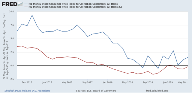
But they aren’t the only long leading indicators to have improved. So has real money supply. Here’s the long term view:


And here’s a close-up of the last few years:


Last year real M2 (minus 2.5%) turned negative, and for several months, so did real M1. Both are now positive again. Note that the closest analogues are 1988 and 2002 - neither of which times coincided with a subsequent recession.

So while the inverted yield curve is a real concern, it isn’t being confirmed by a number of other very valid indicators over the past six months.

Now let’s contrast with the short term forecast. The second half of last year, especially Q4, coincided with the greatest number of the long leading indicators turning south. That means we are heading into treacherous waters in the near term.

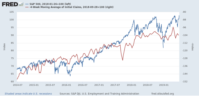
One “quick and dirty” way to look at the short leading indicators is simply to compare stock prices via the S&P 500 (blue in the graph below) vs. initial jobless claims (red, inverted):


In the above graph, stock prices are normed to 100 as of the January 2018 high. Note they have only improved by a little over 3% as of their most recent highs last week. Meanwhile initial claims only improved over their September 2018 lows (shown as a peak) during the three weeks before Easter this year, probably due to residual seasonality.

In short, short leading indicators have been going basically sideways. And as I’ve noted repeatedly in the last few months, the leading employment sectors of manufacturing, residential construction, and temp jobs have all turned flat or downward since January. Whether there’s a recession or not in the short term probably depends on the intensity of Trump’s trade wars, and how much businesses, and business planning, suffers for them.

So if my writing on the economy seems schizoid, it’s because the dour near term forecast depends on the actions of a narcissist who thrives on chaos, while the longer term is being leavened by other very leading sectors.

Sunday, June 23, 2019

Weekly Indicators for June 17 - 21 at Seeking Alpha


 - by New Deal democrat

My Weekly Indicators post is Up at Seeking Alpha.

The Fed moving to a cutting stance helped both stocks and bonds, and improved the long term outlook even more.

Friday, June 21, 2019

Initial jobless claims still weakly positive


 - by New Deal democrat

I have started to monitor initial jobless claims to see if there are any signs of stress.

My two thresholds are:
1. If the four week average on claims is more than 10% above its expansion low.
2. If the YoY% change in the monthly average turns higher.

Here’s this week’s update.


The four week average is 8.6% above its recent low: 


YoY the average is -0.5% lower than this week last June.

Last June the monthly average was 222,000. With two weeks to go this June, it is 219,000:


Like so many other economic indicators at this point, initial jobless claims remain weakly positive.

Thursday, June 20, 2019

Regional Fed indexes confirm that manufacturing is flat


 - by New Deal democrat

[A reminder: this week I’m on vacation, so light posting is the rule.]

Earlier this week the Empire State Manufacturing Index went negative. This morning the Philly Index just barely avoided the same, reported at up +0.3 for June: 
The more leading new orders index declined to +8.3.
This means the average of NY and Philly is a little below -1, while the average of all five regional Fed indexes as of their last reports is +0.8.
Last week I pointed out that the average manufacturing work week had fallen to a point consistent with an oncoming recession, and based on past patterns, I expect layoffs to follow. This week’s two regional indexes show that the leading manufacturing sector, as of the most recent readings, is not in decline, but on the other hand, it is almost exactly flat.

Wednesday, June 19, 2019

Trucking suggests transport slowing, but has not rolled over


 - by New Deal democrat

I have been paying particular attention to the monthly report of the American Trucking Association, to compare its performance with rail, which has been sagging since the beginning of this year. A few other people are relying on the Cass Freight Index, but since that includes international shipping and air transport, it does not exclusively measure the US economy.

In April this index rose 7.7%, and was up 7.4% YoY as well. In May it gave almost all of that back:


According to the ATA, truck traffic declined 6.1% in May, and is now up only 0.9% YoY.

The trend remains neutral to slightly positive, in contrast to rail, suggesting that overall the economy, at least as measured by transport, has slowed down substantially but not yet rolled over.

Tuesday, June 18, 2019

May housing permits and starts consistent with rising trend off bottom, but suggest layoffs to come


 - by New Deal democrat

Although the headlines in the May report for building permits and starts were “meh,” the internals suggest that the bottom has probably already been reached. The downside remains that residential construction employment will decline.

First, let’s look at the headlines for permits (red) and starts (blue). It appears that permits made their bottom 9 months ago, and starts five months ago:


Since starts are much more volatile than permits, I also look at their three month moving average. This is at 1.225 million annualized, a 10 month high.

Single family permits are the least volatile most forward looking measure. These rose off their April low:

No change of trend obvious yet, but my strong suspicion is that April was the low.

On the negative side, housing under construction (blue in the graph below) went sideways, and housing completions (green) fell by almost 10%:


Because residential construction employment (red) tends to turn after construction and contemporaneously or shortly after completions, this morning’s report adds to the evidence that there will probably be layoffs in this leading employment sector.

The big economic question at the moment is whether housing will turn around quickly enough and strongly enough to overcome the negative trends that have become apparent in the first half of this year.

Monday, June 17, 2019

Empire State Manufacturing: OUCH!


 - by New Deal democrat

I’m on vacation this week, so fair warning that there is probably going to be light posting!

The only economic news of note today was the Empire State Manufacturing Index.  Only one district, only one survey, in a noisy series, but just the same, the overall index fell to -8.6 and the new orders component fell to -12:


This brings the average of all five regional Fed Indexes down to +1. If the Philly Index simply declines to +5 or less later this week, then the average will turn negative.

Even that would not be a disaster. Note that in 2015-16 when the Empire State Index was this low or lower, the overall economy remained positive. But unless housing turns around quickly, we have a problem.